
A good business card is easy to read at arm's length, looks like your brand and gives people one clear next step. In practice that means one or two fonts, contact details no smaller than 8 pt, two or three colours with strong contrast, a matte or uncoated finish if people will write on it, and plenty of empty space. Below are the design tips that make the difference, with font, finish and colour choices explained.
What makes a good business card
- It reads in two seconds. Name, role and business stand out first.
- It has one next step: a phone number, website or QR code people will actually use.
- It matches your brand: the same logo, colours and fonts as your website and signage.
- It leaves space. Empty space makes the important parts easier to find.
- It feels right in the hand: a sensible paper weight and finish for your business.
For what to include on the card, see what to put on a business card.
Best fonts for business cards
Choose a font that stays clear at small sizes. Simple sans-serif fonts are the safest choice for contact details; a serif or display font can work for your name or business name if it matches your brand.
| Style | Examples | Good for |
|---|---|---|
| Sans-serif | Helvetica, Arial, Open Sans, Lato, Montserrat, Inter | Contact details, modern brands, tech, trades |
| Serif | Georgia, Garamond, Baskerville, Merriweather | Law, finance, publishing, traditional brands |
| Display or script | Playfair Display, a brand script font | Your name or business name only, never small text |
Use two fonts at most: one for your name, one for everything else. Check the licence if your font isn't free for commercial print.
Business card font size
- Name: 12 to 16 pt.
- Role and business name: 9 to 11 pt.
- Phone, email and address: 8 to 10 pt. Avoid going below 7 pt, which is hard to read for many people.
Print one card and read it at arm's length before ordering. Thin fonts need to be a point or two larger than thick ones.
Matte vs glossy business cards
| Finish | Pros | Cons |
|---|---|---|
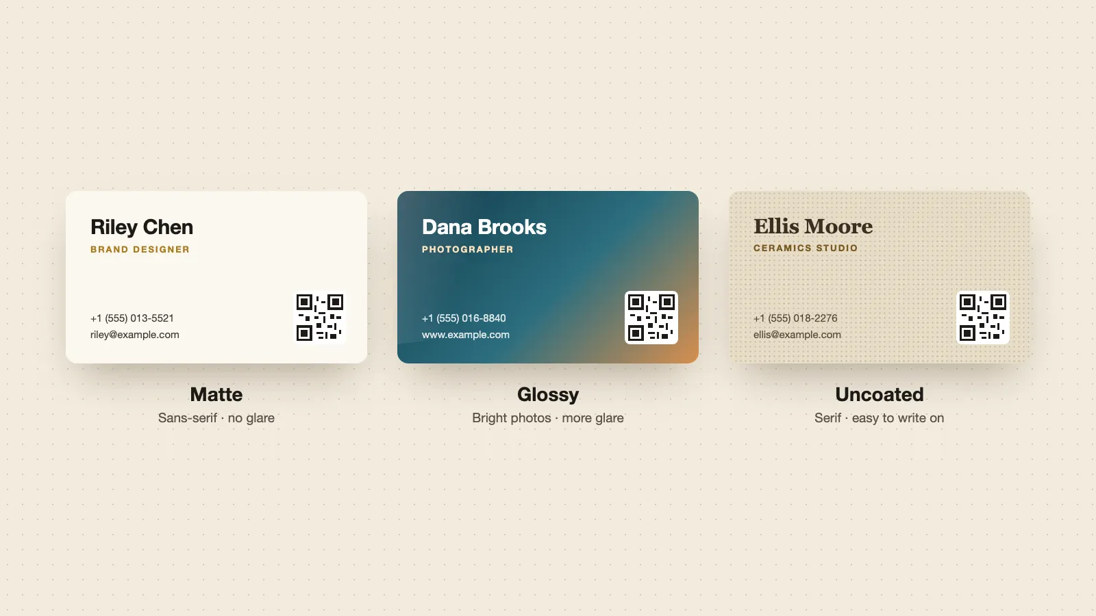
| Matte | No glare, smooth, looks understated, easier to read under bright light, QR codes scan more easily | Colours look slightly softer; can show scuffs |
| Glossy | Colours and photos look brighter and sharper | Glare under lights, shows fingerprints, hard to write on, QR codes can be harder to scan |
| Uncoated | Natural paper feel, easy to write notes on | Ink absorbs, so colours look duller; marks more easily |
Pick matte for most businesses, especially if your card has a QR code or people will write on it. Pick glossy for photo-heavy cards such as photographers, real estate and food. Pick uncoated for craft, eco and handmade brands. Glossy cards reflect light at conference venues, which can stop a QR code from scanning.
Other business card finishes
- Soft-touch: a velvet-like matte coating that feels premium.
- Spot UV: a glossy coating on one part, such as your logo, on a matte card.
- Foil: metallic gold, silver or copper on a logo or name.
- Rounded corners: softer look, fewer bent corners in a wallet.
Special finishes add cost and often time. Keep them to one feature per card.
Best colours for business cards
- Use your brand colours, and no more than two or three.
- Keep strong contrast: dark text on a light background, or light text on a very dark one. Mid-tones on mid-tones are hard to read.
- Keep QR codes dark on light, with a plain margin around them.
- Design in CMYK for print. Screen colours (RGB) often print duller. Use a Pantone colour if your brand colour must match exactly.
- White and cream backgrounds are the safest for small text. Black cards look striking but need larger, bolder text.
Colour also sets the tone. Blue and navy are common for finance and tech, green for health and outdoor brands, black for luxury. Your own brand matters more than any colour rule.
Horizontal or vertical?
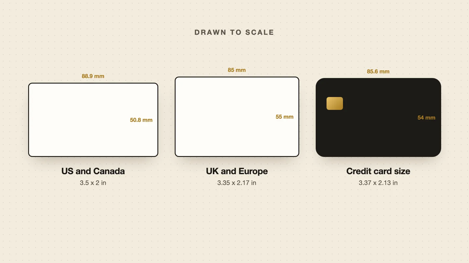
Horizontal is the default and fits most card holders. Vertical cards stand out and suit tall logos, portraits and QR codes. Both use the same size, turned. See business card sizes for the exact dimensions.
Should business cards be double sided?
Usually yes, if the budget allows. Put your name, role and logo on the front, and the details or a QR code on the back. A blank back is useful only if people often write notes on your card. Double-sided printing usually costs a little more than single-sided.
Business card design mistakes to avoid
- Text too close to the edge. Keep everything inside the safe area.
- Too many fonts, colours or details.
- Low-resolution logos that print blurry. Use 300 DPI or a vector file.
- Pale grey text or low-contrast colours.
- A QR code that's too small or on a busy background.
- Out-of-date details. Every job change means reprinting.
Keep your card up to date without reprinting
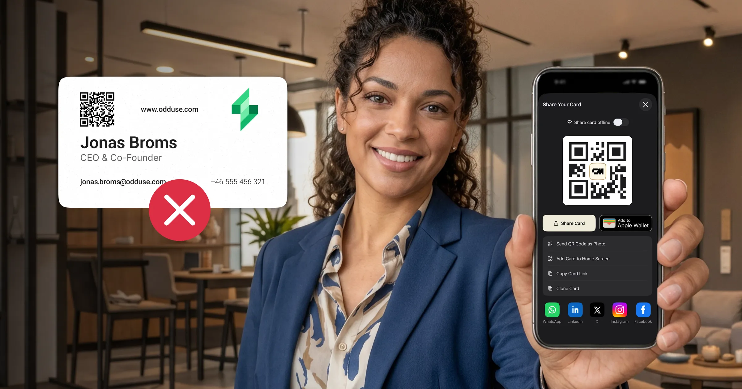
A printed card is fixed the day it's printed. A digital business card can be updated any time, and the same QR code keeps working. Many people print a small run of paper cards with the QR code of their digital card on the back, so the paper card never goes out of date.
Design once, update any time. Make a free digital business card with your logo, photo and colours. Download its QR code for the back of your printed card.